


Table of contents
- 1. Inline Elements
- 2. Block Elements
- 2.1 Definition and Characteristics
- 2.2 Common Block Elements
- 2.3 Use Cases and Practical Examples
- 2.4 Styling Block Elements
- 2.5 Advanced Techniques with Block Elements - Flexbox and Grid: Block elements can be used as flex or grid containers, allowing for more complex layouts. By setting display: flex or display: grid, you can control the alignment and distribution of child elements.
- 3. Inline-Block Elements
- 4. Comparison of Display Properties
1. Inline Elements
1.1 Definition and Characteristics
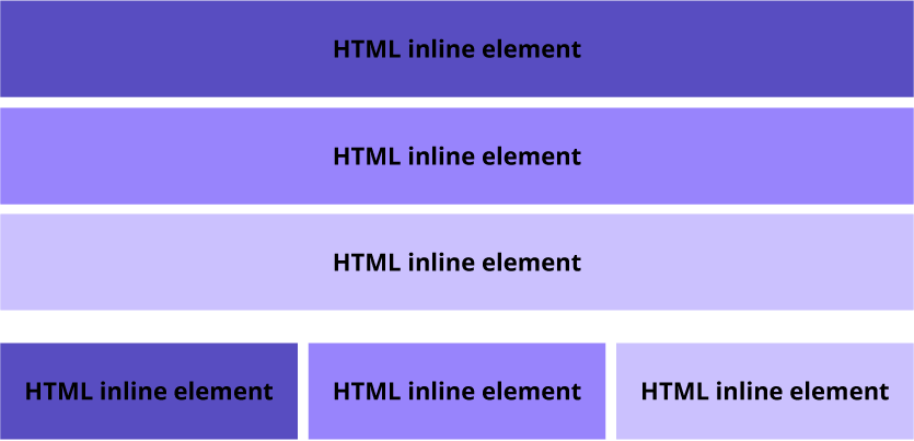
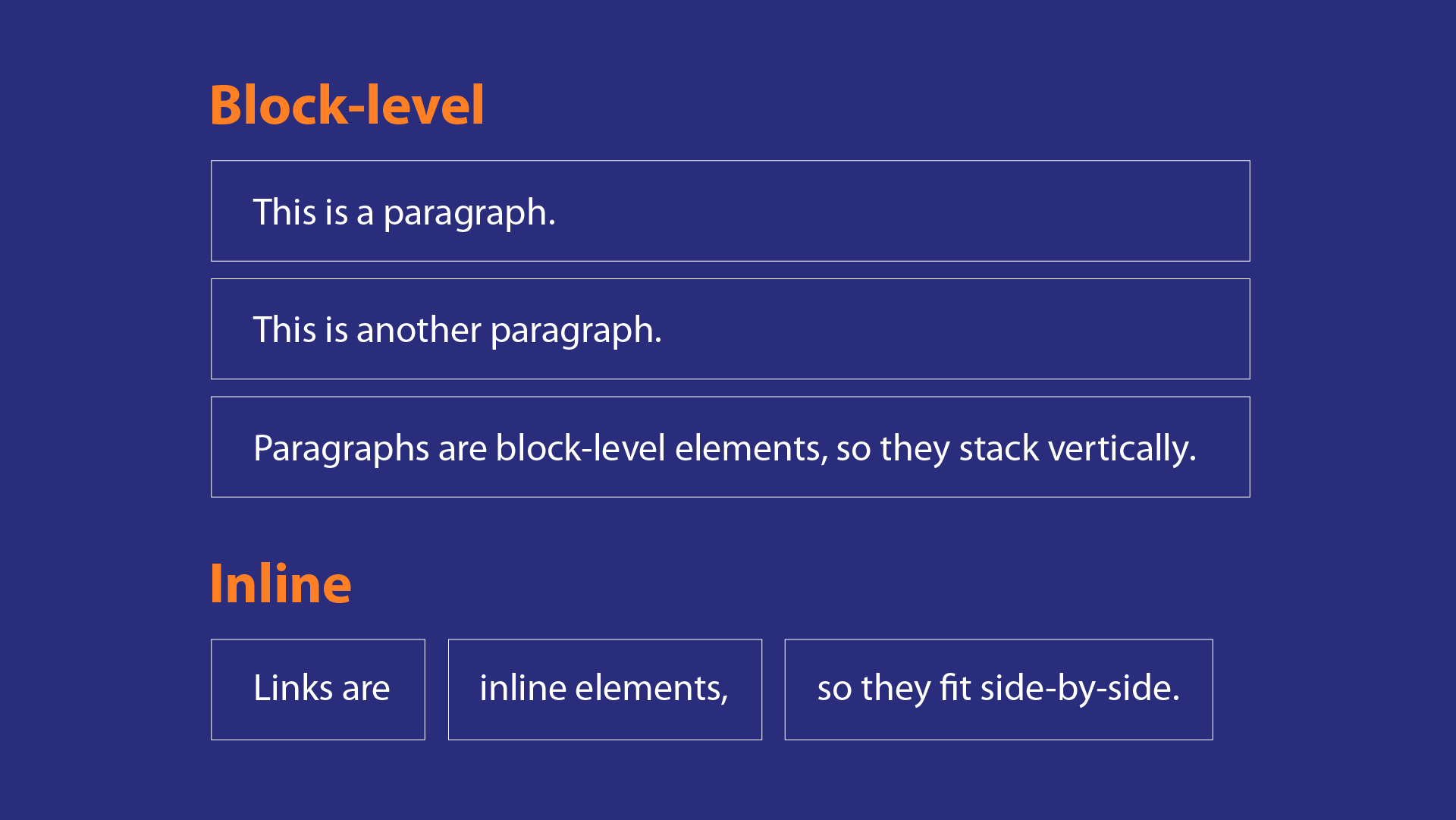
Inline elements are those that do not start on a new line. Instead, they flow within the text, allowing other inline elements to sit beside them. They only take up as much width as necessary, which means they are typically used for smaller pieces of content.
Key Characteristics:
No Line Breaks: Inline elements do not create a new line before or after themselves. They sit within the flow of text.
Width and Height: You cannot set width and height properties for inline elements. Their dimensions are determined by their content.
Margins and Padding: Margins and padding can be applied, but vertical margins (top and bottom) may not affect the layout as expected. Horizontal margins (left and right) will push adjacent inline elements away.
Text Alignment: Inline elements inherit the text alignment of their parent container.
1.2 Common Inline Elements
Some common inline elements include:
<span>: A generic inline container for text.<a>: Hyperlinks that allow navigation.<strong>: Bold text for emphasis.<em>: Italicized text for emphasis.<img>: Images that are embedded within text.

1.3 Use Cases and Practical Examples
Inline elements are perfect for styling specific parts of text without disrupting the flow. For instance, you might want to highlight a word in a sentence or create a link.
Example:
<p>This is an <span style="color: red;">inline element</span> within a paragraph.</p>
2<a href="#" style="color: blue;">This is a link</a>
1.4 Styling Inline Elements
While you cannot set width and height for inline elements, you can still apply styles like color, font-size, and text-decoration.
Example:
span {
2    color: red;
3    font-weight: bold;
4}
5a {
6    text-decoration: none;
7    color: blue;
8}
1.5 Advanced Techniques with Inline Elements
Using
display: inline: You can change the display property of block elements to inline to make them flow with text. However, this can lead to unexpected results if not managed properly.Inline SVGs: Inline elements can also include SVG graphics, allowing for scalable vector graphics to be embedded directly within HTML.
2. Block Elements
2.1 Definition and Characteristics
Block elements are the fundamental building blocks of web layouts. They occupy the full width of their parent container and always start on a new line. This behavior creates a vertical stacking effect, making block elements ideal for structuring content.
Key Characteristics:
Starts on a New Line: Each block element begins on a new line, pushing subsequent elements down.
Full Width: By default, block elements stretch to fill the width of their parent container.
Height and Width: You can set explicit height and width properties.
Margins and Padding: Margins and padding are respected, allowing for spacing between elements.
2.2 Common Block Elements
Common block elements include:
<div>: A generic container for grouping content.<h1>,<h2>,<h3>, etc.: Headings that define the structure of the content.<p>: Paragraphs of text.<ul>,<ol>,<li>: Lists for organizing items.<header>,<footer>,<section>,<article>: Semantic elements that define different parts of a webpage.

2.3 Use Cases and Practical Examples
Block elements are ideal for creating sections of content that need to be visually distinct. For example, a blog post might use <h1> for the title, <p> for the body text, and <div> for grouping related content.
Example:
<div style="background-color: lightblue; margin: 10px; padding: 20px;">
2    <h1>Blog Title</h1>
3    <p>This is a paragraph in a block element.</p>
4</div>
2.4 Styling Block Elements
Block elements can be styled using CSS to control their appearance. Common styles include background color, borders, margins, and padding.
Example:
div {
2    background-color: #f0f0f0;
3    border: 1px solid #ccc;
4    margin: 20px;
5    padding: 15px;
6}
2.5 Advanced Techniques with Block Elements - Flexbox and Grid: Block elements can be used as flex or grid containers, allowing for more complex layouts. By setting display: flex or display: grid, you can control the alignment and distribution of child elements.
- Responsive Design: Using media queries, you can adjust the styles of block elements based on screen size, ensuring a responsive layout.
3. Inline-Block Elements
3.1 Definition and Characteristics
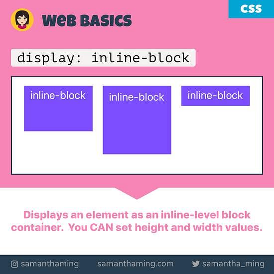
Inline-block elements combine the characteristics of both inline and block elements. They flow within the text like inline elements but can have width and height set, allowing for more control over layout.
Key Characteristics:
No Line Breaks: Like inline elements, inline-block elements do not start on a new line.
Width and Height: You can set explicit width and height properties, allowing for more precise control over layout.
Margins and Padding: Margins and padding can be applied, and both vertical and horizontal margins will affect the layout.
Alignment: Inline-block elements can be aligned using text alignment properties, similar to inline elements.
3.2 Common Inline-Block Elements
While any element can be made inline-block, common examples include:
<img>: Images can be displayed inline with text while maintaining their dimensions.<button>: Buttons can be styled as inline-block to fit within text flows.<input>: Form inputs can be displayed inline with other elements.
3.3 Use Cases and Practical Examples
Inline-block elements are useful for creating layouts where elements need to sit next to each other while still allowing for width and height adjustments. For example, a navigation menu can use inline-block for each menu item.
Example:
<ul style="list-style-type: none; padding: 0;">
2    <li style="display: inline-block; margin-right: 10px;">Home</li>
3    <li style="display: inline-block; margin-right: 10px;">About</li>
4    <li style="display: inline-block; margin-right: 10px;">Contact</li>
5</ul>
3.4 Styling Inline-Block Elements
You can style inline-block elements similarly to block elements, but with the added flexibility of inline behavior.
Example:
li {
2    display: inline-block;
3    background-color: #e0e0e0;
4    padding: 10px;
5    border: 1px solid #ccc;
6}
3.5 Advanced Techniques with Inline-Block Elements
Vertical Alignment: Inline-block elements can be vertically aligned using the
vertical-alignproperty, allowing for precise control over their positioning relative to surrounding text.Responsive Layouts: Inline-block elements can be used in responsive designs, allowing for fluid layouts that adapt to different screen sizes.
4. Comparison of Display Properties
4.1 Visual Representation
| Property Type | Starts on New Line | Width Control | Height Control | Common Use Cases |
| Inline | No | No | No | Text styling, links |
| Block | Yes | Yes | Yes | Structuring content, sections |
| Inline-Block | No | Yes | Yes | Navigation menus, mixed layouts |
4.2 Key Differences
Flow: Inline elements flow within text, while block elements create a new line. Inline-block elements allow for both behaviors.
Dimensions: Inline elements cannot have width or height set, while block and inline-block elements can.
Margin Behavior: Vertical margins behave differently; inline elements may not push adjacent elements, while block and inline-block elements do.
4.3 When to Use Each Type
Use Inline: When you want to style small pieces of content without disrupting the flow of text.
Use Block: When you need to create distinct sections of content that require full-width control.
Use Inline-Block: When you want elements to sit next to each other while still having control over their dimensions.